Ludus app Design
A place to better organize your game collection.
Cataloguing for video game enthusiasts
Overview
Ludus is a mobile app prototype that offers a dynamic platform for users to discover new video games, manage their personal collections, and share their insights and opinions with a lively community of fellow gamers through ratings and written reviews. This prototype was created as part of an Interaction Design I class taught at Kennesaw State University. Our team loosely employed the Goal-Directed Design (GDD) methodology detailed in the book About Face by Alan Cooper to create this prototype.
The Pitch
Our team leader, Bo, shared his idea with the class by talking about how his video game collection has grown across various platforms and systems over the years. Managing a large and diverse collection has become challenging, making it hard to stay organized. Bo noticed that others might face similar difficulties in keeping track of their video game collections. This realization sparked the idea for our project: an app that allows gamers to better manage their collections and share their thoughts with like-minded individuals.
Role
UI Design, UX Research
Timeline
Feb - Apr 2023
Approach
Goal-Directed Design (GDD)
Tools
Figma, FigJam, Discord
Role
UI Design, UX Research
Timeline
Feb - Apr 2023
Approach
Goal-Directed Design (GDD)
Tools
Figma, FigJam, Discord
Cataloguing for video game enthusiasts
OVERVIEW
Ludus is a mobile app prototype that offers a dynamic platform for users to discover new video games, manage their personal collections, and share their insights and opinions with a lively community of fellow gamers through ratings and written reviews. This prototype was created as part of an Interaction Design I class taught at Kennesaw State University. Our team loosely employed the Goal-Directed Design (GDD) methodology detailed in the book About Face by Alan Cooper to create this prototype.
The Pitch
Our team leader, Bo, shared his idea with the class by talking about how his video game collection has grown across various platforms and systems over the years. Managing a large and diverse collection has become challenging, making it hard to stay organized. Bo noticed that others might face similar difficulties in keeping track of their video game collections. This realization sparked the idea for our project: an app that allows gamers to better manage their collections and share their thoughts with like-minded individuals.
The team
Meet the Ones Who Made It Happen
Click on the pictures to visit my teammate’s portfolios!
THE Approach
A Quick Lesson
What is Goal-Directed Design?
Goal-directed design is a user-centered approach to design, originally developed by Alan Cooper, that focuses on understanding and fulfilling the goals of users and stakeholders. The overall aim is to create an interface and product experience that is intuitive, efficient, and helps users achieve their desired outcomes. This approach contrasts with design solely focused on aesthetics or specific features without considering how they meet user needs.
Pictured below are the steps that make up Goal-Directed Design.
Due to this project being part of a university course, we had to make some alterations to the GDD process in order to fit our course timeline. As a team of only designers and no developers, we were not able to complete the “Support” step. Additionally, while we understand that there is never an “end” to the iteration process of GDD, our product had to be complete after 10 total weeks.
Research
Getting Started
Kickoff Meeting
In a typical project setting, the initial stage of Goal-Directed Design often involves a kickoff meeting, a crucial gathering where stakeholders and designers come together to establish shared goals and solidify the project's purpose. This meeting serves as a platform for open communication, allowing different perspectives to be heard and integrated. It's during this collaborative process that a clear vision and roadmap are established, ensuring everyone involved is aligned towards a common objective.
However, the project we undertook differed from this traditional approach due to its academic setting. Since this project was completed within the framework of a class, the concept of external stakeholders was not applicable. Instead, our professor provided a pre-defined template to guide our initial meeting. Through this simulated setting, we, as a team, were able to establish a shared understanding of the project's objectives and define our own internal goals as a team.
During this kickoff meeting, we created the following product problem statement:
Product Problem Statement
The current state of video game social cataloging and reviewing has focused primarily on individual internal marketplaces. What existing products/services fail to address is centralization and audience scores. Our product will address this gap by consolidating video game libraries and highlighting audience reviews.
Literature Review
Our lit review involved examining relevant scholarly articles, industry reports, and internal documents related to video games, user behavior, and media organization. This exploration aimed to provide a deeper understanding of the context surrounding Ludus, allowing us to ask more informed questions during stakeholder interviews.
The review focused on four key areas: the state of the video game industry, video game reviews, self-assessment scales, and how people organize media.
What we found:
  • Customers often face limitations on how much they can spend on games.
  • The majority of games are now purchased digitally.
  • User ratings significantly impact purchase decisions.
  • A game's success is evaluated based on various factors, not just sales.
  • Effective game organization is crucial for user navigation and decision-making.
Competitive Analysis
Next, we conducted a competitive analysis to analyze Ludus's key competitors: Stash, IGN, GameTrack, and GG. This process involved examining their strengths and weaknesses, aiming to understand their success factors and identify potential areas where Ludus could differentiate itself.
What we found:
  • Several competitors showcased appealing and user-friendly interfaces.
  • All competitors offered easy methods for adding games to user collections.
  • None of the competitors offered a social aspect in their platforms.
  • Most competitors made it cumbersome for users to both rate and write reviews.
  • While some competitors offered list creation capabilities, they were not as robust as what we envisioned for Ludus.
Interviewing Our Users
Persona Hypothesis
To gain deeper insights and tailor our interview process, we began by crafting a persona hypothesis. This involved asking ourselves key questions: Who are our potential users? What are their typical behaviors and habits? What needs and desires are they hoping to fulfill with our product?
By answering these questions, we developed a clear understanding of our ideal user, allowing us to strategically select interviewees most representative of our target audience.
Persona Hypothesis
Our persona is likely to be someone who...
  • Is an opinionated gamer looking to write/read reviews
  • Is looking for game recommendations
  • Wants to catalog their games
  • Wants to see what games their friends are playing
Time to Interview!
Due to time constraints, our team contacted five individuals between the ages 18 and 25 within our network of friends who closely aligned with our persona hypothesis to take part in the interviews. Each participant had the following characteristics: considers gaming to be one of their main hobbies, has multiple gaming systems, and desires to find new games to play. These interviews took place over one week on Discord.
During the interviews, we aimed to uncover the role video games played in our interviewees’ lives, with an emphasis on how they find, rate, and organize games.
Interview with Participant #4
Interview with Participant #5
Mapping Our Findings
To streamline the information collected from each interview, our team utilized a method called Affinity Mapping. This approach involved allocating 5-10 minutes for us to jot down our individual insights from the interviews onto sticky notes. Once the time limit was reached, the information was consolidated, and related insights were categorized into groups.
Affinity Map from Participant #1’s interview
Affinity Map from Participant #2’s interview
What We Observed
After synthesizing all research collected from our user interviews, we were able to determine the following:
  • Cross-platform tracking: All participants used multiple platforms and expressed a strong desire to track their entire collections in one place. Many mentioned the need to connect existing libraries from other systems.
  • Review preference: Four participants prioritized user reviews over critics' reviews when making purchase decisions. They emphasized the value of personal and relatable experiences.
  • Rating systems: While all participants favored a 1-10 rating scale, some also valued a binary "recommend" system for quicker decision-making.
Modeling
Personas in the Making
Identifying Behavior Variables
Creating our personas involved taking the raw data collected during the research stage and transforming it into tangible representations of users and their interactions with our product. This helped us as designers gain a deeper understanding of user needs, goals, and behaviors, ultimately leading to better design decisions.
The first step in this process was to analyze interview data, user observations, and other research findings to identify common patterns and trends in user behavior, motivations, and goals. From the research, we were able to identify sixteen distinct behavior variables that emerged as key themes in our participants' responses.
Each interviewee was assigned a unique number and their responses were then mapped onto scales corresponding to each behavior variable. This allowed us to quantify their responses and identify patterns. The identified patterns were visually clustered together, and these clusters became the foundation for developing our primary and secondary personas, embodying different user types with shared needs and characteristics.
Behavior variables
Behavior variables grouped into clusters
A Small Hiccup
Unfortunately, this was where we ran into a problem. Though we were easily able to identify behavioral trends with what we believed to be our secondary persona, we had trouble defining trends with what we believed to be our primary persona. It was quickly determined that only one participant (Participant #2) was in favor of manually cataloging their games, while every other participant preferred an automatic cataloging system. Thus, the main purpose of our app – an app where users can manually catalog their game collection – was underrepresented in our research.
Despite this, our team decided to push forward with Participant #2’s behaviors representing the behaviors of our primary persona, and Participant #1, #3, and #4’s behaviors representing the behaviors of our secondary persona.
Our Personas
Meet Avery and Riley!
Avery is our primary persona. He represents the target audience of Ludus, and the team created the prototype with his goals in mind. Avery displays the behaviors of an individual who loves manually cataloging their game collection and reading/writing reviews.
Riley is our secondary persona. While not our target audience, she may still enjoy some features of Ludus. The design team considered Riley’s goals when working on the prototype, but did so without negatively impacting Avery’s experience. Riley displays the behaviors of an individual who prefers an automatic cataloging system and wants to connect with friends.
Requirements
Writing our list
Learning From Our Personas
In the Requirements phase, one of the shortest stages of the GDD process, we took on the perspective of our personas. We asked ourselves: If these individuals were using Ludus, how would it integrate into their daily lives? What specific features would best support them in achieving their goals?
To address these questions, our team created "context scenarios" for each persona. These narratives functioned as detailed stories, depicting the everyday lives of our personas, with a particular focus on situations where they would interact with Ludus. By crafting these scenarios, we were able to demonstrate how Ludus could effectively address the needs of each persona.
Leveraging these context scenarios, the team then identified a comprehensive list of feature requirements. We believed these features would be essential in delivering an optimal user experience for Ludus, based on the insights gleaned from our personas. This defined list of requirements subsequently served as the foundation for developing the framework of our prototype.
Primary Persona Requirements List
  • Write a review for a game when needed (PP)
  • Edit a review after it has already been posted (PP)
  • View entire collection when wanted (PP)
  • Comment on others reviews when needed (PP)
Both Personas Requirements List
  • Search for games when needed (BP)
  • View the average game score when needed (BP)
  • View game details when needed (titles, price, platform, system reqirements, year, publisher, genre) (BP)
  • Games sorted by play-status when set (BP)
  • Display games the user is currently playing when needed (BP)
  • Change game status when updated (BP)
  • Rate game on a quantifiable scale when needed (BP)
  • Recommend game on a binary scale when reviewing (BP)
  • Add a game to collection when needed (BP)
Secondary Persona Requirements List
  • View friends activity when needed (SP)
  • View friends profile/collection when needed (SP)
General Requirements List
  • Onboarding Process
  • Home Screen
  • Profile Screen
  • Collection Screen
  • Settings Configuration
  • Search Screen
Frameworks
Hopping into Figma
Lo-Fi Wireframing
With our requirements list in hand, we used Figma to create a low-fidelity wireframe of our app. This helped us explore Ludus's overall layout, estimate the number of screens needed, and determine the information displayed on each screen.
Once our lo-fi screens were complete, we drew out our key path and validation scenarios. Looking at the image, the yellow lines represent our key path scenario – the most commonly used path. The blue lines represent our validation scenarios – the paths that are used less frequently.
Hi-Fi Wireframing & Prototyping
After finalizing the low-fidelity wireframe, we moved on to building and prototyping high-fidelity mockups. Fortunately, our team leader, Bo, had already established a style guide for Ludus during a previous class, saving us the time and effort of crafting one from scratch. This comprehensive guide provided clear instructions on various branding elements including Ludus's color palette, typography choices, iconography, logo usage, and recommended spacing.
Pictured below is our complete high-fidelity prototype. The blue arrows on the right image each represent a link a user can click on and where that link will take them. Creating flows in Figma can definitely get messy!
Refinement
Testing and Polishing
Conducting Usability Tests
We invited two interviewees from our user interviews to take part in usability tests conducted via Discord. During the tests, the participants were asked to complete different tasks while verbalizing their thought process. This helped us pinpoint areas of our prototype that were causing confusion or frustration with our users.
Key insights from these tests were:
  • Having the process of changing a game’s status, rating it, and writing a review on three separate pages confused users – they were unsure if their progress was being saved once they moved onto the next page
  • Users were unsure if the content on the search page was clickable
  • Having a circle represent the average user rating was confusing – users were unsure what the scale was out of or how many users had contributed to the score
Fixing Issues and Making Things Pretty!
Based on user feedback and usability issues encountered during the usability tests, we made the following changes to our prototype:
Rating and Reviewing Flow
  • Condensed information into two pages rather than three
  • Reworded buttons to ensure users would be aware that their work would be saved
Game Details Page
  • Removed the circle from the game rating
  • Added “/10” to let users know what scale the rating was on
  • Added the amount of users who contributed to the rating
Search Page
  • Removed most colors so it would be less distracting
  • Added arrows at the end of each item so users know they’re clickable
The Final Product
Introducing Ludus
Ludus is an the ultimate app for video game enthusiasts, offering a centralized platform where they can engage in all things related to gaming. With Ludus, gamers can access a diverse range of features and tools, including the ability to create a game collection, rate games, and write/read reviews. By taking advantage of the friends feature, gamers can also conveniently keep up with the gaming activities of their friends.
You can interact with the full prototype in the window below ↓
Reflections, Reflections
What Did I Learn?
  • Recruit relevant users. Focus on interviewing participants whose behaviors align with your project's vision. This ensures insights directly relevant to your goals.
  • Establish design systems early. Before starting the high-fidelity prototype, create a design system. This will guide consistency in visual language and user experience across your product.
  • Prioritize user needs. Always center your designs on users' goals. This prevents designing features based on personal preferences and ensures the product truly fulfills its intended purpose.
  • Embrace collaboration. Creative disagreements are natural in teamwork. Finding compromises and combining strong ideas can lead to far better solutions than individual efforts. The collaborative process fosters innovation and pushes boundaries.
What I Wish We Did
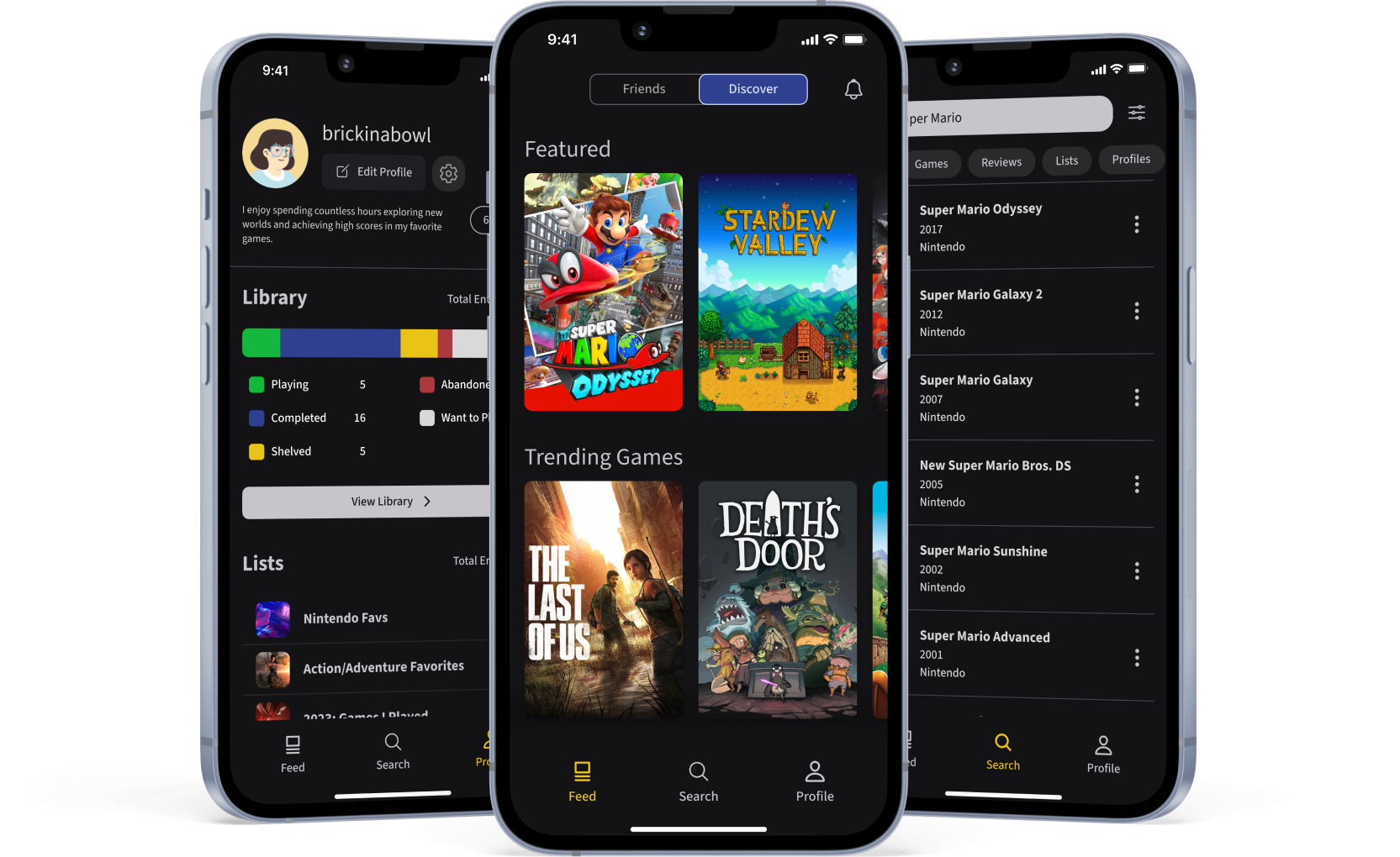
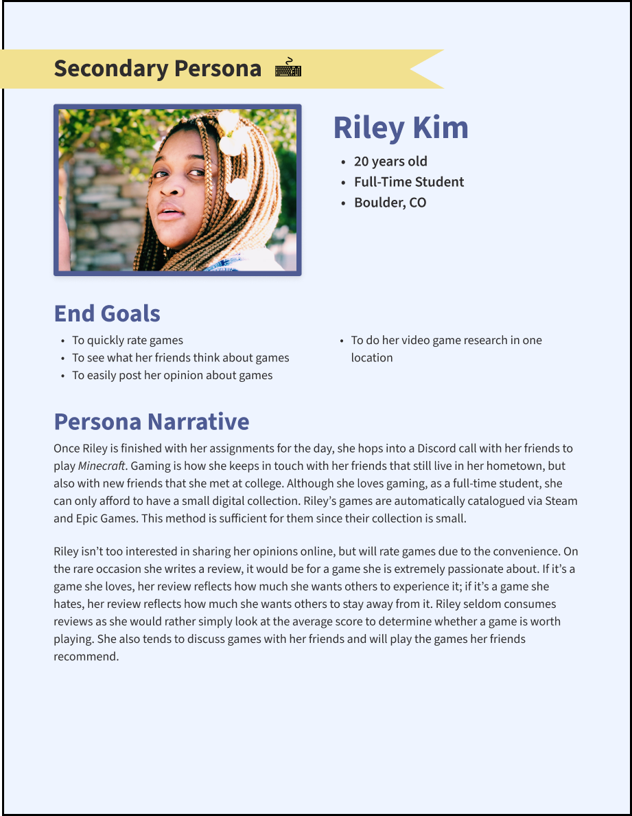
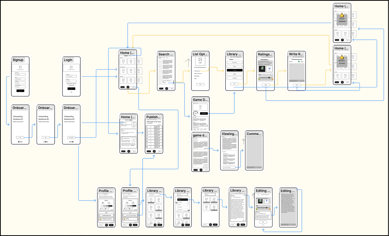
Throughout my design education and from conversations with other UX designers, I've learned the importance of showcasing your specific role in team projects for your portfolio. Unfortunately, for our first collaborative UX project, task delegation wasn't our team's strongest suit. We ended up working on every aspect together; each of us contributed to every screen, moderated interviews with our own participants, and conducted research on our respective domains and competitors. 
While teamwork has its merits, I truly believe that establishing individual tasks rather than team-based ones would have allowed for better delineation of our roles and created a smoother process for building the wireframe and prototype. If one person had been responsible for each screen, receiving feedback from the team, rather than all four of us working simultaneously, the process would likely have been more efficient.
Interested in seeing more? Check out some of my other work!  (✿◠‿◠)
Brightree: Summer 2023 Internship
UI Design
Hermes: Ticketing Kiosk Design
UI/UX Design & Research
Concert Buddies: Platonic Matchmaking
UI/UX Design & Research